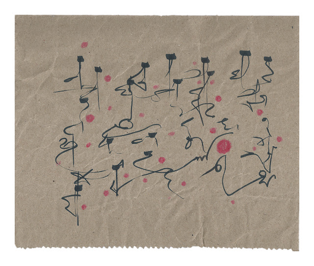
Magazine: The Cut-Up Asemics by Scott Helmes is available now around the world at Amazon.
Here is Scott's description of his book: "Where does the text go after it’s been read? Pure Asemic writing is the
total dissolution of the text, leaving traces of the human hand. These
works occupy the space between the initial visual text and the pure
asemic result. Initially taken from print magazines, primarily selected
for the text and typography forms, these works are visual/concrete
states of the above process.They reflect memory loss, partial
comprehension of meaning and non-verbal sensory input. These too will
evaporate at varying rates, depending upon how they are inputted and the
‘reading’ by the viewer. The additional element of what appears to be
motion/movement represents the active role of physical writing, the
passage of time and loss of meaning. The works start when Helmes finds
magazines with interesting type styles. He works primarily with black
printing as he feels color is an intrusive meaning, and then tears out
selected pages as a first step. India ink is then applied to blank
8-1/2” x 11” plain, paper using either a palate knife or a rubber
eraser. The ink-marks are done in a free style writing motion that does
not follow the typical typesetting grid. After an over-all ink image is
finalized, the magazine pages are torn up into individual elements that
are placed on the page and within the frame work of the ink marks. The
original meaning of the type is then altered and loses its references.
The type then becomes suggestive, especially when the various forms are
placed in new relationships with other ‘letters’. Usually attached to
the ink lines, the letters begin their total dissolution into
nothingness. Without the reader being able to reference the original
text, the reader brings to the process their ideas/thoughts about what
the text ‘says’. Sometimes whole words or groups of words are included,
but these are selected based wholly upon a visual need as opposed to
making language sense. Helmes feels these works become after-images and
extend the reading and memory process to a unique form and retinal image
that is tacked on whatever is left of the language memory. By now
becoming a complete work, they extend the life of the
magazine/text/writing, as opposed to just the memory of the textural
meaning. Some of the early works were given the title of ‘Bones’, which
is meant to convey language being stripped of the ‘flesh’ of the word
and being left with absolute basics of its form. Later works are just
dated and contain no further references,thus enabling a concrete point
in the transition to Asemic writing."
- Paperback: 70 pages
- Publisher: Post-Asemic Press (October 11, 2019)
- Language: English
- ISBN-10: 1732878889
- ISBN-13: 978-1732878884
-
Product Dimensions:
6 x 0.2 x 9 inches
- Shipping Weight: 5.6 ounces
- Price: $16.00
Blurbs:
In Magazine, there is poise; there is intention. Letters
form openings, letters form arrows into openings. There is sexual heat, there
is calm, there is clarity. There are lacey places like thin branches that form
something together. Going deeply into the book, the images turn block-like,
with greater conformance to solid letters. Some of the forms as humanoids
resist each other or veer together. Angles are musical, even lamp like. Always
there are edges. Always there are magnets and pulse-driven points of strength.
Nothing is finished. Or everything is. Color is mildly allowed as suggested,
but only that. A calligraphic zeal and respite all in one confirm a mind that
plays precisely.
This is asemia at its purest. To the point that when I
reach the author photo page, I reflexively begin to subtract flecks of the dark
jacket and the word “Columbia.”
—Sheila E. Murphy
From
among all the visual poets working today, Scott Helmes is the one most
focused on the letter, especially the fragment thereof. His goal is not
the word. His purpose is to examine the fractured letter in its
typographic and calligraphic manifestations, to see what there is to
understand in the atomization of written language, to uncover how the
corners of individual letters can make us recall the language as a
whole. In the poems in this collection, he merges his two major
practices and fashions collage poems that mix the fluid rigidity of his
favorite typographic forms with rough and painterly brushstrokes of ink,
thus tying together the handmade forms of inking with the machine-made
curves and slices of type. In this way, he reconnects two major
practices in visual poetry, presenting us with two views of this world:
the clean and the dirty—and the beauty of both.
—Geof Huth
Click on the following links to buy the book at Amazon:
Amazon USA
Amazon Australia
Amazon Brazil (Brasil)
Amazon Canada
Amazon France
Amazon Germany (Deutschland)
Amazon India
Amazon Italy (Italia)
Amazon Mexico
Amazon Spain (España)
Amazon UK
Here are some sample pages from Magazine:
Scott Helmes is a poet, book artist,
writer, artist, architect and photographer. His experimental poetry has been
collected, published and exhibited worldwide for over 40 years. Books include 1000
Haiku, Stamp Pad Press; Poems From Then to Now, Redfoxpress
(Ireland), and The Last Vispo Anthology: Visual Poetry 1998-2008,
Fantagraphics. In 2015, two works were included in The New Concrete, an
international concrete poetry anthology from Hayward Press, London. 13 poems were published as part of the
Kobitadihi Online Magazine World-wide Visual Poetry, April 2017. An
altered book was exhibited in the Wallpaper exhibition at Traffic Zone
in July, 2018. His studio is located in Minneapolis, MN, USA.


